UX Design Case Study: Healthy Homes Mobile App
How do you find a non-toxic home? What is a non-toxic home? Is your home affecting your health? These are the questions people with compromised health ask every day. They may spend many hours and hours researching one simple question and still not really find satisfying or comprehensible answers.
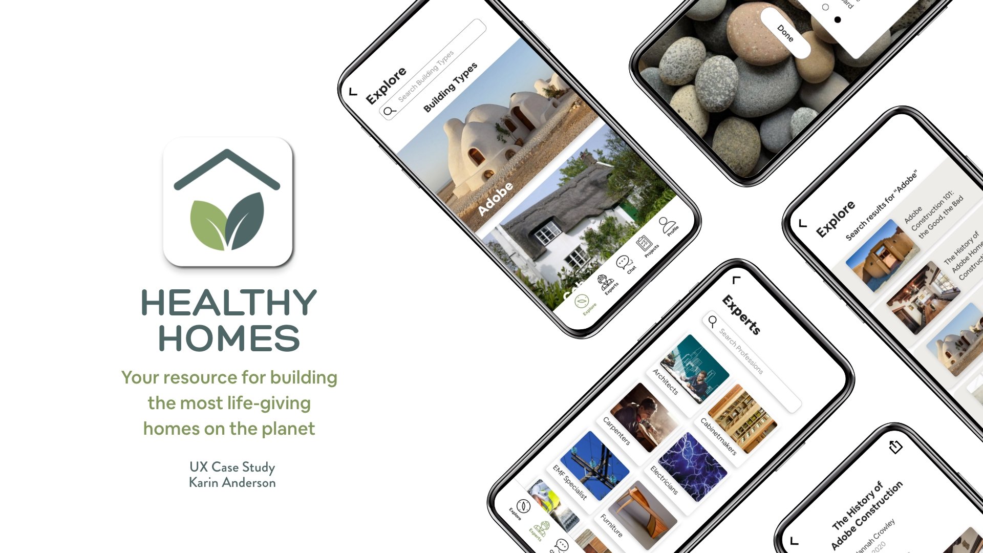
Hence, this app was born. Healthy Homes is the natural, non-toxic, and alternative housing version of Houzz for all things related to residential homes.
Role: UX Designer, UX Researcher, UI Designer

Reflections.
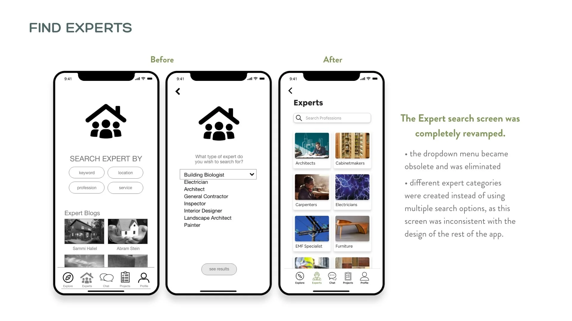
Simplify, simplify, simplify: Even when I thought the functionality could not be any simpler, older users still struggled with basic tasks in testing. I found I needed to keep simplifying and clarifying tasks throughout my development process.
Giving credit where credit is due: Keeping track of who created what image by adding info to the file name helped to keep track of who to give credit to once everything I didn’t use was lying on the cutting floor. I ended up needing a great deal of imagery and found that I really needed to institute a better process for handling this from the start.
When in doubt, reach out: Soliciting feedback repeatedly was critical because of the sheer volume and complexity of the information contained within it and the wide variety of different types of users. There was not a particular age group or gender or education level for my user, so it needed to appeal to and be functional for a wide audience. It couldn’t be so simple, it would be goofy for younger users, or too complex or the older users would have been left behind. It was a dance between the two.
Going forward: It was a challenge to reign the project in because early on it was obvious that there was potential to expand into eCommerce. Testers suggested offering non-toxic furniture, décor items, books, etc. It was exciting to see these possibilities, however, and contemplate the next iteration.


