UI Design Case Study: Madison Responsive Web App
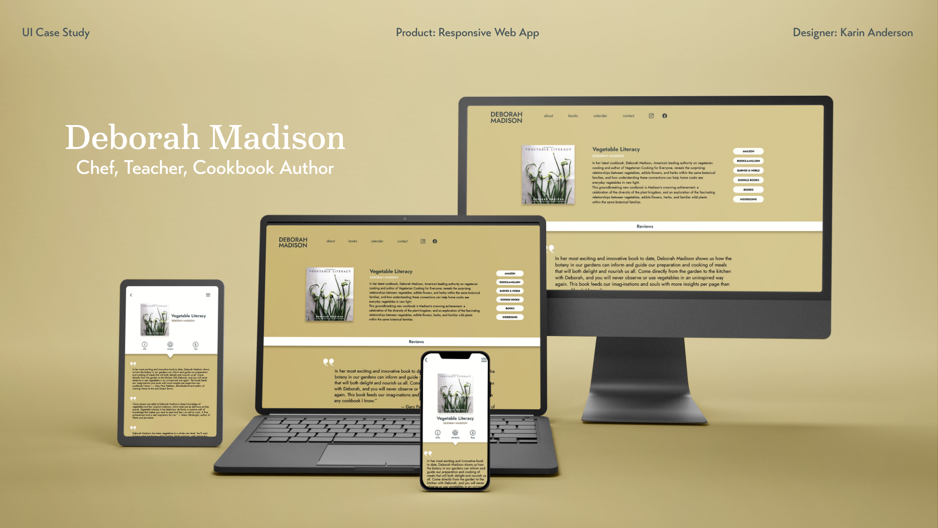
I am a huge fan of the celebrated chef, teacher and cookbook author Deborah Madison. I own several of her marvelous cookbooks and have gifted them more times than I can count. So I decided to take a stab at redesigning her non-responsive website. My goal was to make it both visually more attractive and to improve its functionality.
Role: UI Designer


Reflections.
Colors: Although I love bright, exciting colors, they do not necessarily support content by showcasing it. Instead, color can upstage the content. So I needed to reign in my technicolor exuberance in deference to the end goal of this product.
It can never be too organized: Getting assets straight (naming convention applied, layers properly grouped, etc.) from the get-go makes everything less confusing and streamlines the whole process. It’s much easier to “organize” as I go then try to untangle chaos at the end.
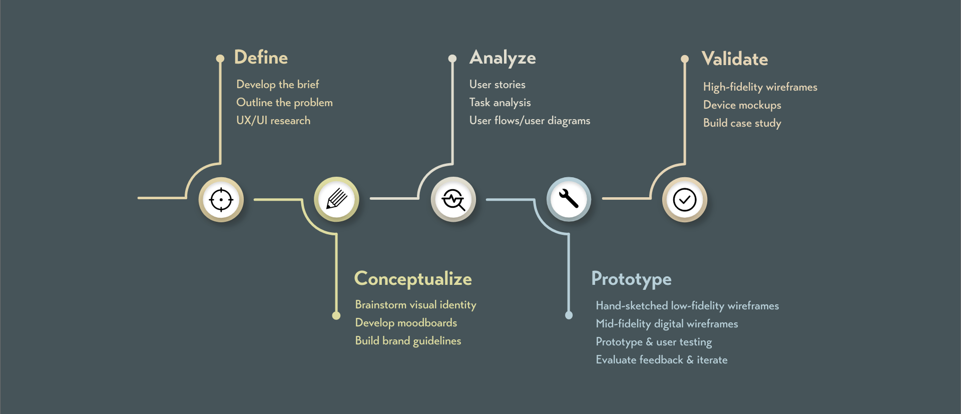
Ask for feedback along the way: I made sure to keep asking my potential users to run through the app and give me feedback. This not only improved the way it looked and functioned, I also got some great suggestions I hadn’t even thought of.
Always sketch out ideas and concepts beforehand: Even though this is like a no brainer, it’s such a temptation to dive in and start making things pretty. There is a process for a reason. It ends up saving a lot of time in the long run. But I find it to be a discipline.


